


The projects I work on as a colour consultant
A look into my portfolio

Building a portfolio as a colour consultant is tricky. Unlike interior designers, who help shape every element of a space, we focus purely on paint. That means our work is just one part of a much bigger picture, often layered over existing finishes and furniture. Our 'end result' isn’t a picture-perfect space but more personalised and expert guidance that helps clients cut through the overwhelm. We guide, suggest, and support, then hand it over. It’s the client who brings it all to life, and as a result, we rarely walk away with styled, photo-ready images.
I have worked on thousands of room makeovers, but I have very little imagery to show for it. I often get asked to see the kind of projects I work on, and I’ll admit, I’ve put off showing anyone, as I don’t have lots of Instagram-worthy photos. But instead of showing you, I thought it was time to write about it instead.
Most of my projects are residential... first-time buyers, third-time buyers, DIYers, serial renovators, families, couples, expats, everybody and anybody. I’ve also worked on a few commercial projects, from hair salons, a veterinary studio (!), hostels, hotels, Airbnbs and long-term rentals. I’ve consulted with clients at home, during hair appointments, on work breaks, even from hospital beds. That’s the beauty of virtual consultations; we get to chat wherever you are and work around your day-to-day, no matter what that looks like.
It's so hard to choose just a handful, but here’s a small selection of some of my favourite projects so far...
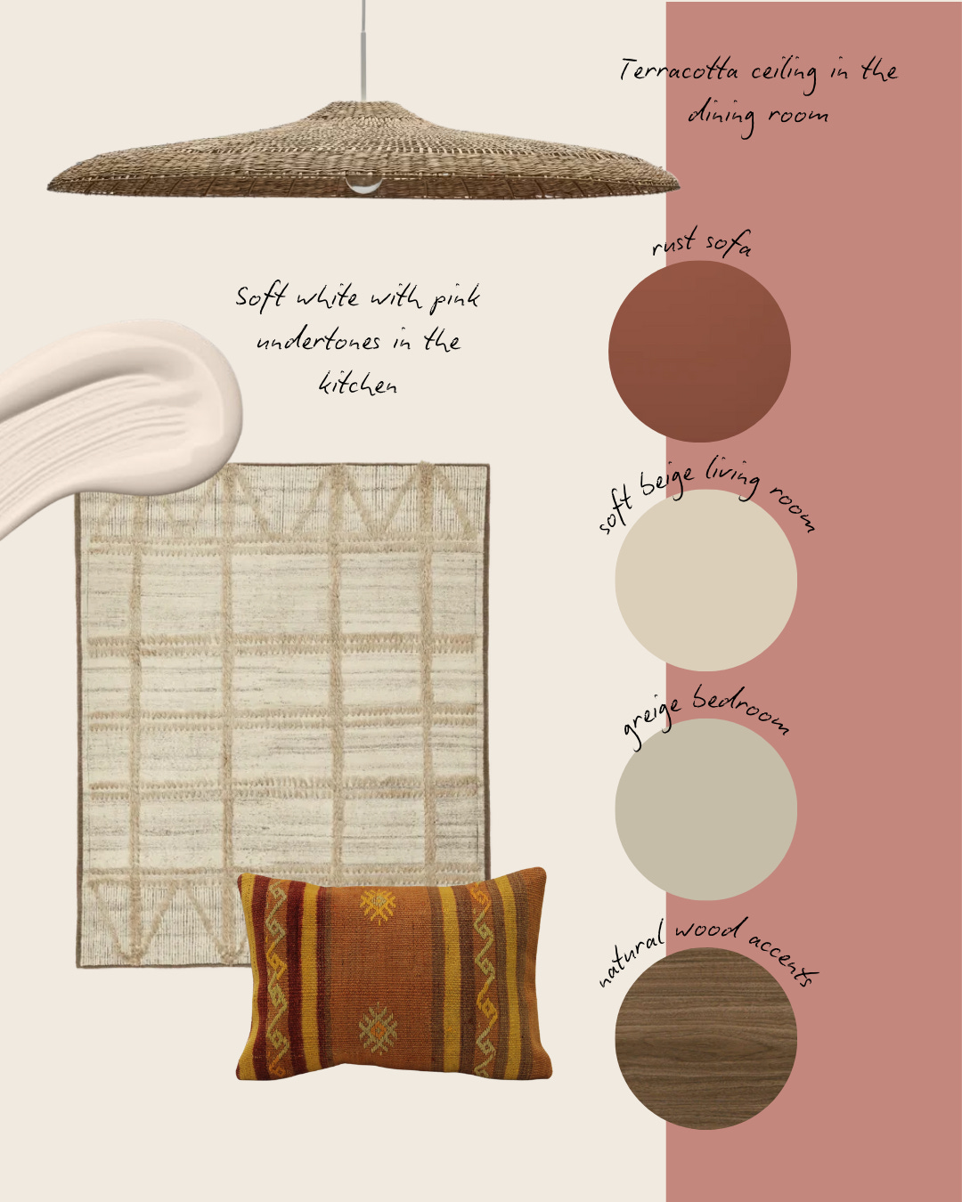
A small home on an eucalyptus farm in Portugal. My clients were a couple from the UK and the US who had upped sticks and moved to the Portuguese countryside for a slower pace of life. They came to me with a couple of initial ideas and a bucket load of enthusiasm, and together we curated a colour scheme for their entire home that reflected them, their surroundings and their new lifestyle.
We opted for a soft, balanced beige in the open-plan living areas to let the natural materials and finishes take centre stage, which were important to the couple and key to the home’s grounded, rural feel. A standout feature was my client's dream rust-red sofa, which we used as a bold anchor in the space. This warm terracotta tone was then echoed in the separate dining room, where we painted the ceiling to visually lower the room and create a more intimate atmosphere for hosting dinner parties.
In the bedroom, we chose a calming greige with green undertones for a subtle nod to the eucalyptus groves just outside.
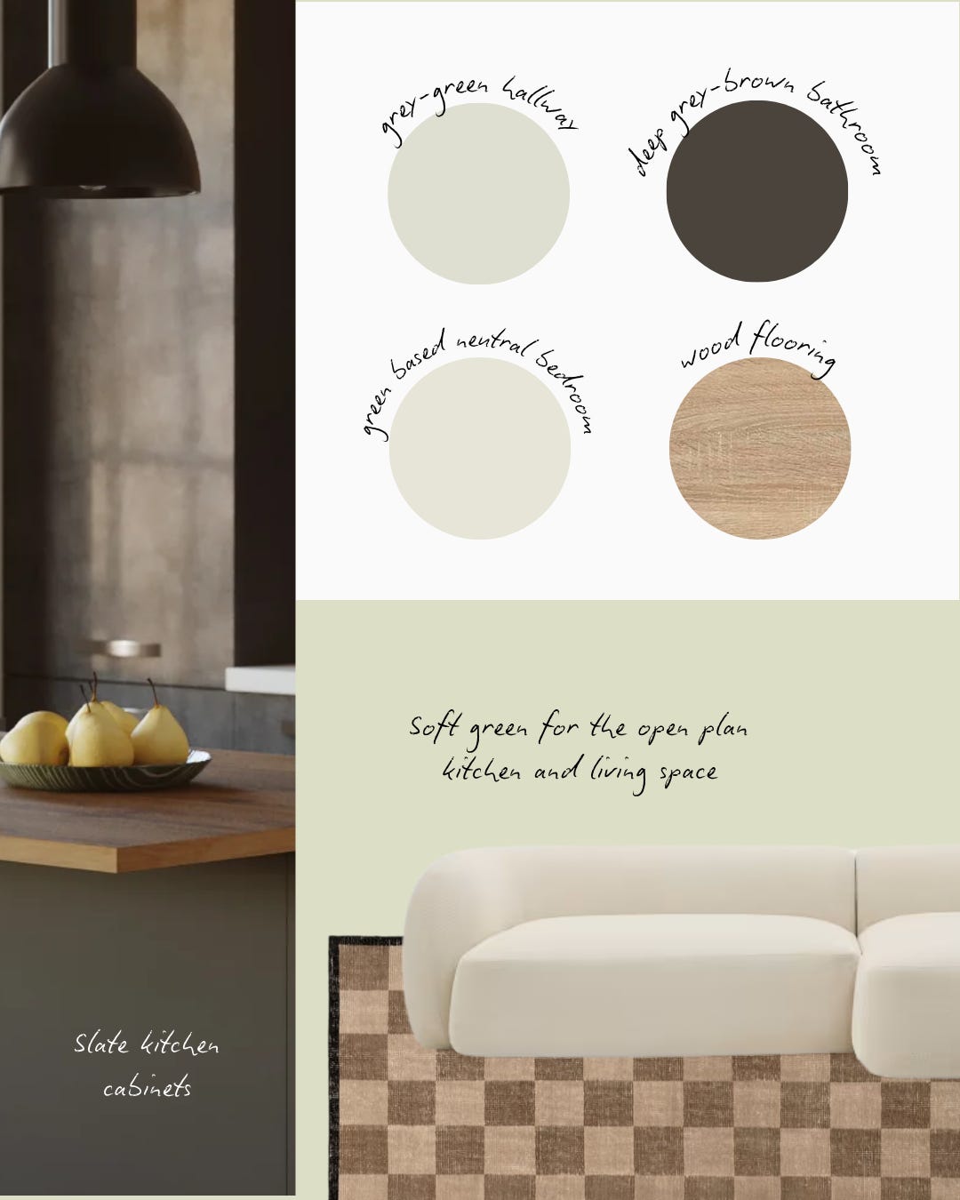
One project that I will never forget was a young first-time buyer who had bought an industrial apartment in the heart of London. He came to me for colour guidance with mental health in mind. We spent a lot of time discussing how our homes can impact and support our mental health, especially as self-employed creatives who spend a lot of time either working from home or travelling. We dug deep into how he used his home, what he needed from it to live well and feel good, and how we could translate that with colour.
He was naturally drawn to greens and warm, earthy grey tones that feel grounded and calming. In the kitchen, we chose a light green with grey undertones to complement the slate black cabinets, bringing light into the space. In the bedroom, we opted for a neutral with a green base, for a zen feel that still felt connected to the main living area. Finally, in the bathroom, we introduced a deep grey-brown colour, perfect for creating a sense of retreat within a more industrial shell.
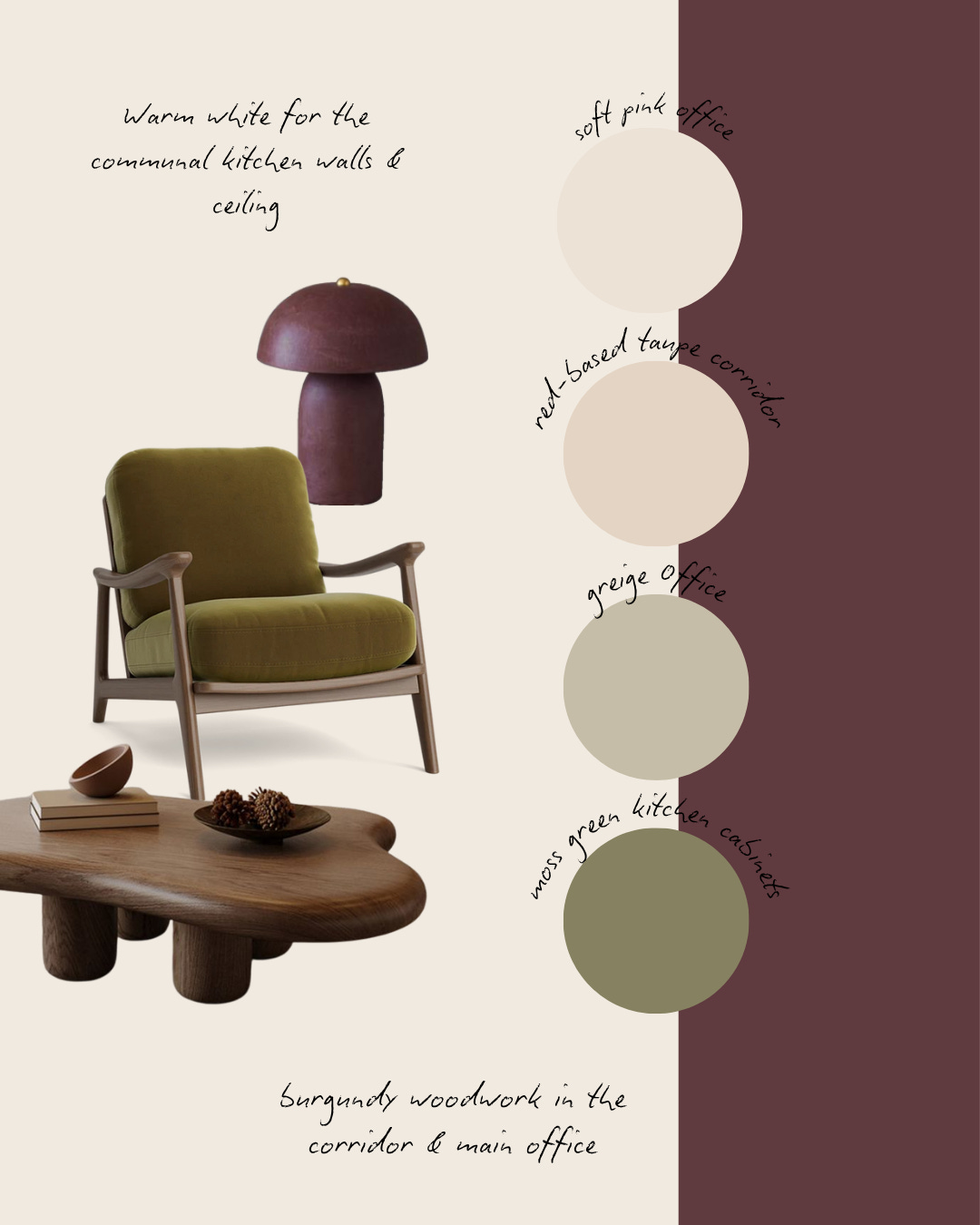
Healthcare offices in London. This project involved transforming outdated offices for a healthcare company specialising in dementia and palliative care. I love any project that focuses on healthcare, and this one was particularly special, being a commercial and communal space, rather than a private home. I worked closely with the director to reimagine the space on a tight budget, working with the existing architectural features and fixed interior elements that couldn’t be replaced.
The goal with the colour scheme was to elevate the space, inject warmth and personality, and create an environment where staff genuinely enjoy working and spending time together.
We chose a timeless palette for the kitchen: moss green cabinets paired with a pink-based white for the walls and ceiling. In the offices, we explored softer tones, one in a calming dusty pink, the other in a balanced greige, to ensure the spaces felt inclusive and welcoming for all staff. The existing burgundy metal staircase became a design feature in itself, inspiring subtle burgundy accents throughout the rooms to tie the whole interior together.
One of my latest consultations was with an Irish family who had recently moved back from Australia and were building their dream home in the Irish countryside. Aside from being a dream to work with, we curated a scheme that transported their love of the Aussie beach lifestyle to the outskirts of Dublin. Sound strange? Well, we did it with a thoughtful colour palette that travelled continents while still feeling right at home.
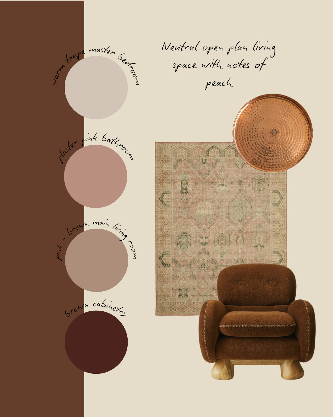
A boutique hotel in Spain. This was one of my first consultations, would you believe, and such a fun opportunity to work with a beautiful family from the UK who had moved to Spain with their 4 children in tow. They were renovating their existing guesthouse and decorating their new boutique hotel. This was a dream consultation for me, as they were big fans of my favourite Mediterranean palette: olive greens, terracotta, plaster pink and soft neutrals.
To celebrate the original architecture, we kept the exterior white and brought a peach-based plaster pink into the communal areas, including the yoga room, dining room, and remote-working spaces, for a soft, sun-washed feel. In the bedrooms, we leaned into the natural Mediterranean palette with olive greens and terracotta tones. Some rooms were fully colour-drenched for a bold, cocooning effect, while others featured light walls with colourful woodwork to keep things bright and airy. The result was a calm, grounded atmosphere rooted in its surroundings.

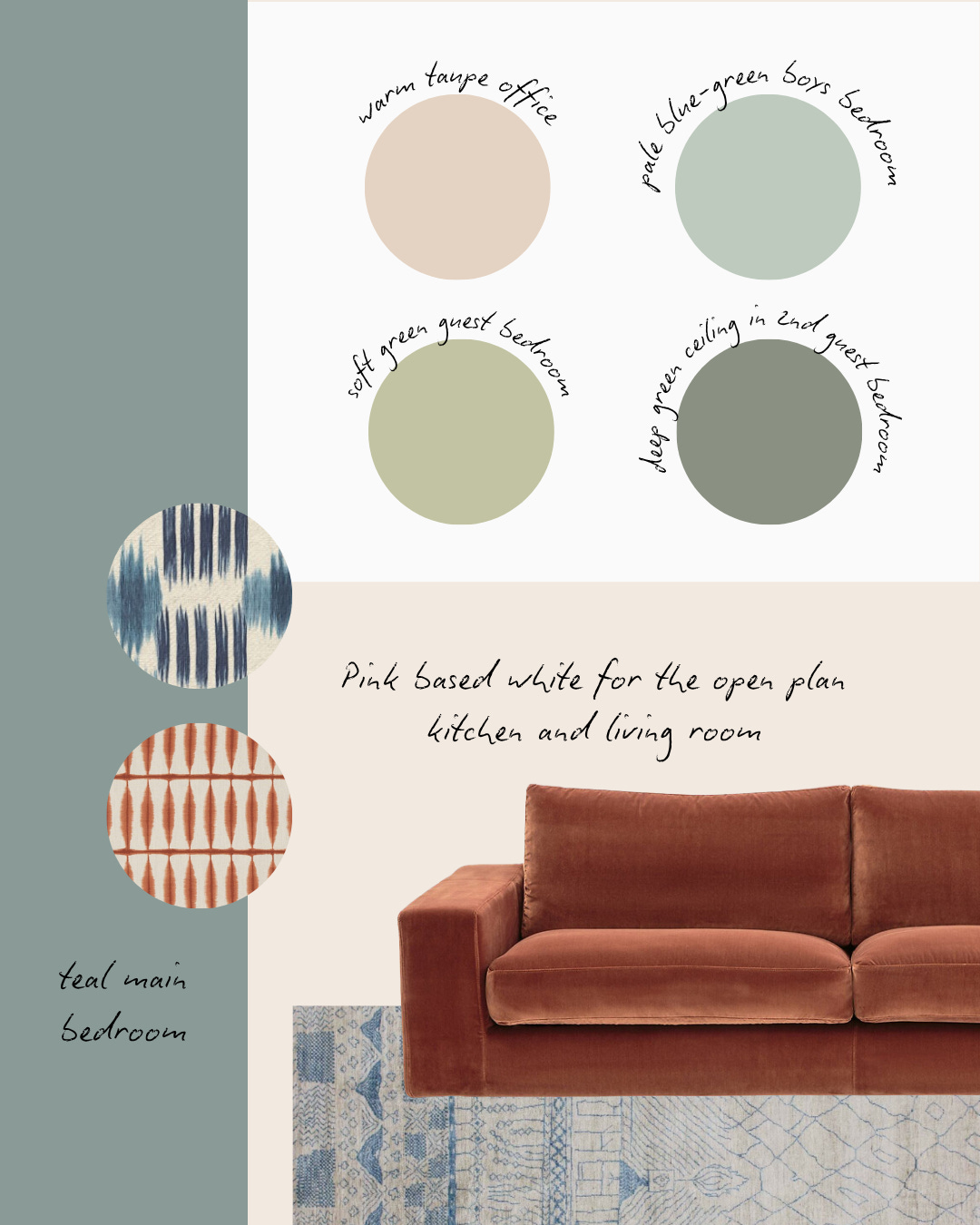
A family home in Paris. This project was all about creating a warm, characterful first home for a British-French couple in their newly purchased Parisian apartment, complete with original parquet flooring and charming architectural details.
My client wanted a space that reflected her eclectic style and love of warm pinks, reds, and soft neutrals, while her husband gravitated toward cooler tones like blues, teals, and greens. The challenge was to strike a balance between their individual tastes while creating a cohesive colour scheme throughout the entire home.
We carefully curated a palette that included both of their preferences, using different rooms to showcase different moods from teal bedrooms to a warm taupe office and a terracotta and blue living space. The result is a home that feels layered, personal, and unmistakably theirs.
This is just a peek at some of the projects I’ve been lucky to work on. I hope you enjoyed reading through them, and if you like this type of article, let me know, because I’ve got plenty more favourites that I’d love to share!
I love your post. Love the 🎨 color scheme. So tranquil and peaceful.
I loved this, more please!