
Understanding Undertones
Ever chosen the perfect paint colour, only to find it looks completely different on your walls? Welcome to the world of undertones, one of the most misunderstood concepts in colour

Oh, the humble undertone. You’ll have heard me, other colour experts and designers talk a lot about these. Put simply, they are the subtle hints of colour beneath the surface of a paint shade that make a colour warm or cool, and in my opinion, the secret ingredient to curating a harmonious paint palette.
I like to think of undertones like the base notes in a perfume; they may not be immediately obvious, but they shape how a colour feels and behaves in a space.
A general rule is that…
Cool undertones range from blue, grey and black, while warm undertones lean towards yellow, pink, red and brown.
Why Undertones Matter
Undertones influence how colours interact with one another, with the light, and with the materials around them. When they clash, it can make a room feel slightly ‘off’ even if you can’t quite put your finger on why.
They are also what give a colour its character. Brown, grey and black undertones give colours a muddy or earthy feel, full of soul and personality. Blue undertones can pull a colour to the cool side, while hints of green can lift a neutral towards a more complex tone. Undertones of yellow, red or pink, on the other hand, inject instant warmth.
So we could say that it’s the undertones that prevent colours from feeling flat and lifeless.
What to Look For & How to Find Them
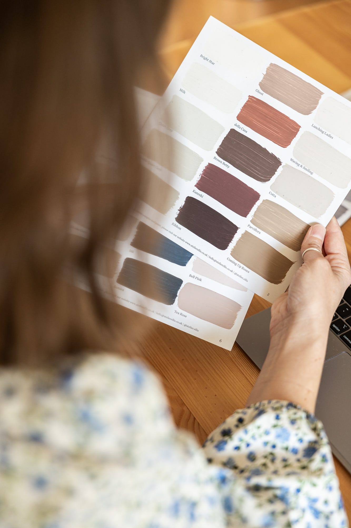
The easiest way to see a paint’s undertone is to hold the sample vertically against a sheet of pure white paper. This contrast helps the underlying hue really pop.
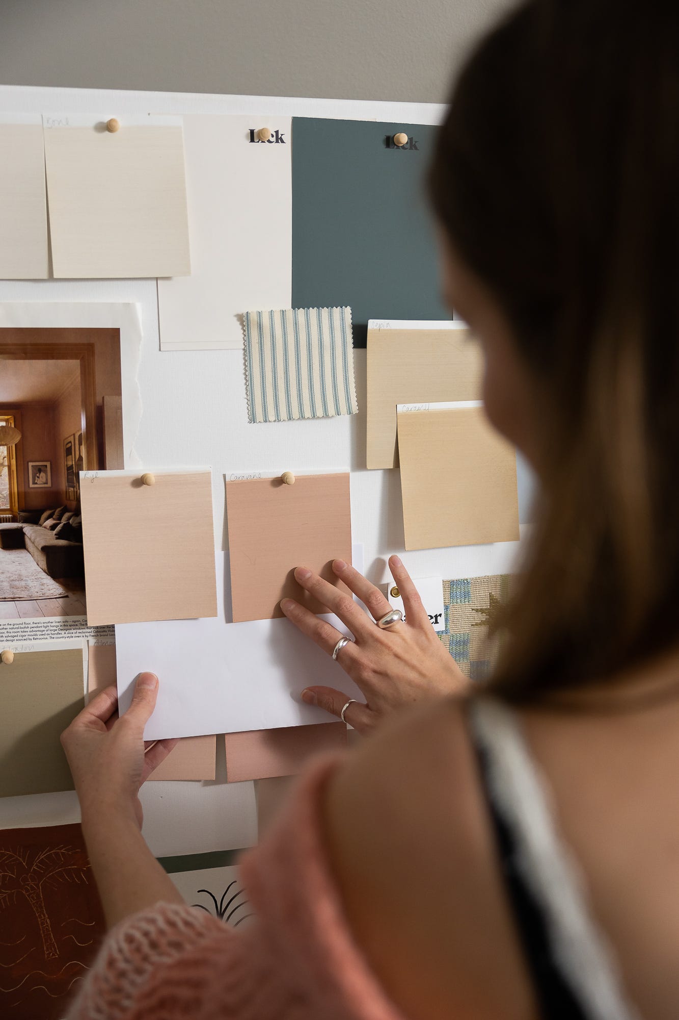
It’s important to do this vertically, so that you get the most accurate look at the colour. When we place samples flat on a table or the floor, the light hits them differently, which can distort how the colour appears. It’s still a great way to build a mood board and see how materials work together, but always bring your paint samples up onto the wall to make your final call.
If you place a couple of colours next to each other (two or three at the most), you’ll start to notice which ones feel warmer, cooler, softer or sharper. This comparison is the best way to train your eye, but don’t worry if you can’t see the differences straight away. I always advise my clients to live with the samples for a few days and look at them in different lights, to see how they transform throughout the day. For a visual on how to do this, head over to my video here.
My Top Tip: Don’t be afraid to ask paint brands for a detailed description of their colours. They have a team of colour specialists behind the scenes who know the paint colours inside out and can tell you the pigments and undertones in each colour.
Choosing Undertones in Your Hemisphere
In the Northern Hemisphere:
North-facing rooms – use warm undertones to counterbalance the diffused, blue-toned light.
South-facing rooms – cool undertones are your friend here. They help offset the golden light, keeping things fresh and balanced rather than too yellow or intense.
East and West-facing rooms deserve special attention.
East-facing rooms get beautiful, clear morning light that fades into cooler shadows later in the day. Whether you use the space in the mornings or evenings, I generally recommend leaning into warm undertones that will catch that early light beautifully but balance the cooler evening light.
West-facing rooms, on the other hand, come alive in the afternoon and evening. They can feel a little shadowy in the morning but bathe in rich, golden light later on. If you spend afternoons and evenings here, you might prefer cooler undertones to keep things balanced once the sun floods in. If it’s a space you use earlier in the day, warmer undertones will help lift the natural dimness and create a more welcoming feel.
In the Southern Hemisphere: Simply swap these ideas around.
I can’t stress enough that these are guidelines, not strict rules. You might decide to embrace the natural warmth of your light rather than counter it, or choose tones that suit the mood you want to create at the time of day you use the space most. Let how you live in the space guide your decisions.
Can you Mix Warm & Cool Undertones?
When I studied Colour Psychology, we were taught that every colour fits into one of four tonal groups. Colours within the same group (whether light or dark) naturally harmonise, while mixing undertones usually creates dissonance.
But… I’m going to (very gently) challenge that.
After years of working with homeowners, I’ve found that undertones, like most things in design, are open to interpretation. And what we might learn in theory doesn’t always translate clearly to real-life products and paints. What reads as ‘warm’ to one person may feel ‘cool’ to another, depending on how they perceive colour.
So yes, I do think combining colours with the same or similar undertones works best, but you can mix warm and cool undertones; it simply requires balance and intention.
We never see colour in isolation, so every colour and material you bring together shapes how the others are perceived. The key is to consider your colour scheme (not just your paint, but the fabrics, tiles, flooring, etc.) holistically and not as separate, individual elements.
I recently worked on a kitchen colour scheme where my client had chosen brown-bronze cabinets with light, sandy walls, and wanted to incorporate a bright green-blue wall tile. Although beautiful, this saturated colour felt instantly jarring against the otherwise earthy palette, so we softened it and opted for a more muted blue tile instead. The warm, grey undertones in the new blue felt more in keeping with the overall scheme, while still providing the contrast and accent of colour the client was looking for. So, it just goes to show how small shifts in undertone can completely change the overall feel of a space.
But my best advice? Don’t get too caught up in the theory. You’ll know deep down if something feels off, so trust your instincts and your eye. Ultimately, what matters most is that your space feels right to you.
Love C x
And this is exactly why it all comes down to context and preference. If you have an overhanging roof over a south facing room, they'll be no sunlight to balance, so warm tones sounds just right! 🙏
I love Sulking Room Pink! Its gorgeous and its muddy undertones make it the perfect partner for black. Do you find it fairly 'easy' to see the undertones in your colours?
Really enjoyed this one