


The Hottest Colours from Milan Design Week 2025
What they mean and why they look so good

I’m excited about this piece. This is where I get to completely indulge in my favourite topic: colour. If it’s ok with you, I’m not going to write a lovely intro, setting the scene for the article. Instead, I’m going to dive right in and get straight to the good stuff! (If you’d like to read more about the event itself, the trends and takeaways, head over here.)
To be completely transparent, there are sooo many colours that crop up throughout Milan Design Week, but this list is a selection of the main players, plus the accent colours that we can expect to see more of.
Brown with a Twist
Brown made a big appearance last year at MDW, then Pantone released Mocha Mousse as its colour of the year, so no surprise that it was everywhere to be seen this year too. I’m calling it brown with a twist because we had chocolate browns, mocha browns, red browns, terracotta brown blends and brown with purple undertones. Muuto showcased a cocooning sitting room colour drenched in brown, playing on a monochromatic scheme as its backdrop, with brown walls, tiles and curtains in ever so slightly varying tones. I loved the attention to detail here, incorporating brown even into the table leg and a bold dose of cobalt blue.


The Bocci apartment is another firm favourite of mine to visit during MDW, and it didn’t disappoint with an almost ombre effect wallpaper in varying shades of brown that transformed with the light. Paired with wood panelling and furniture, this bedroom felt like a cocooning respite away from the chaos of the city.
In the living room, brown accents against a neutral backdrop offered a little lift to the space as an everyday zone. A chocolate armchair and dusty brown coffee table continued the brown colour story, creating a cohesive, grounded palette that felt thoughtfully pulled together.


Plum
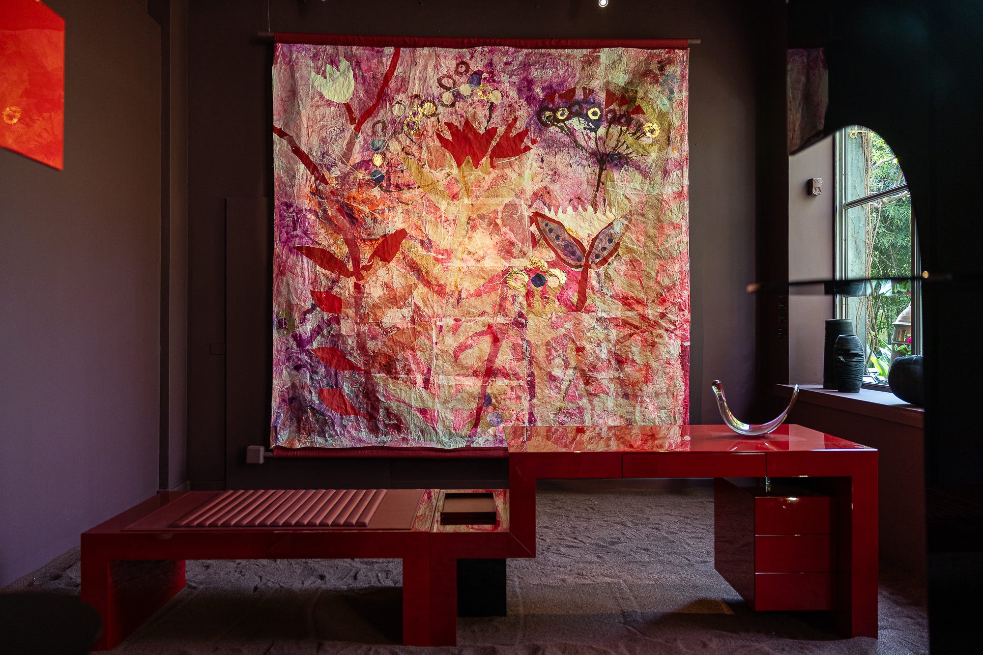
While aubergine and burgundy have been on everyone’s lips for the past year or two, MDW brought plum to the stage. What’s the difference, I hear you say? Well, very little, they are all deep purples with varying red undertones, but plum is ever so slightly softer. It has a dash of white to lift it from a deep, moody purple into a brighter purple. The main players were outdoor squidgy plum sofas, curved leather plum armchairs, and a colour-drenched room in Rossana Orlandi’s gallery, paired with bright red furniture and oversized textile art. Safe to say, this colour’s going nowhere.


Sunshine Yellow
When Dulux announced their 2025 colour of the year as a bold primary yellow, I wasn’t convinced. But MDW proved me wrong with this sunshine hue making an appearance.
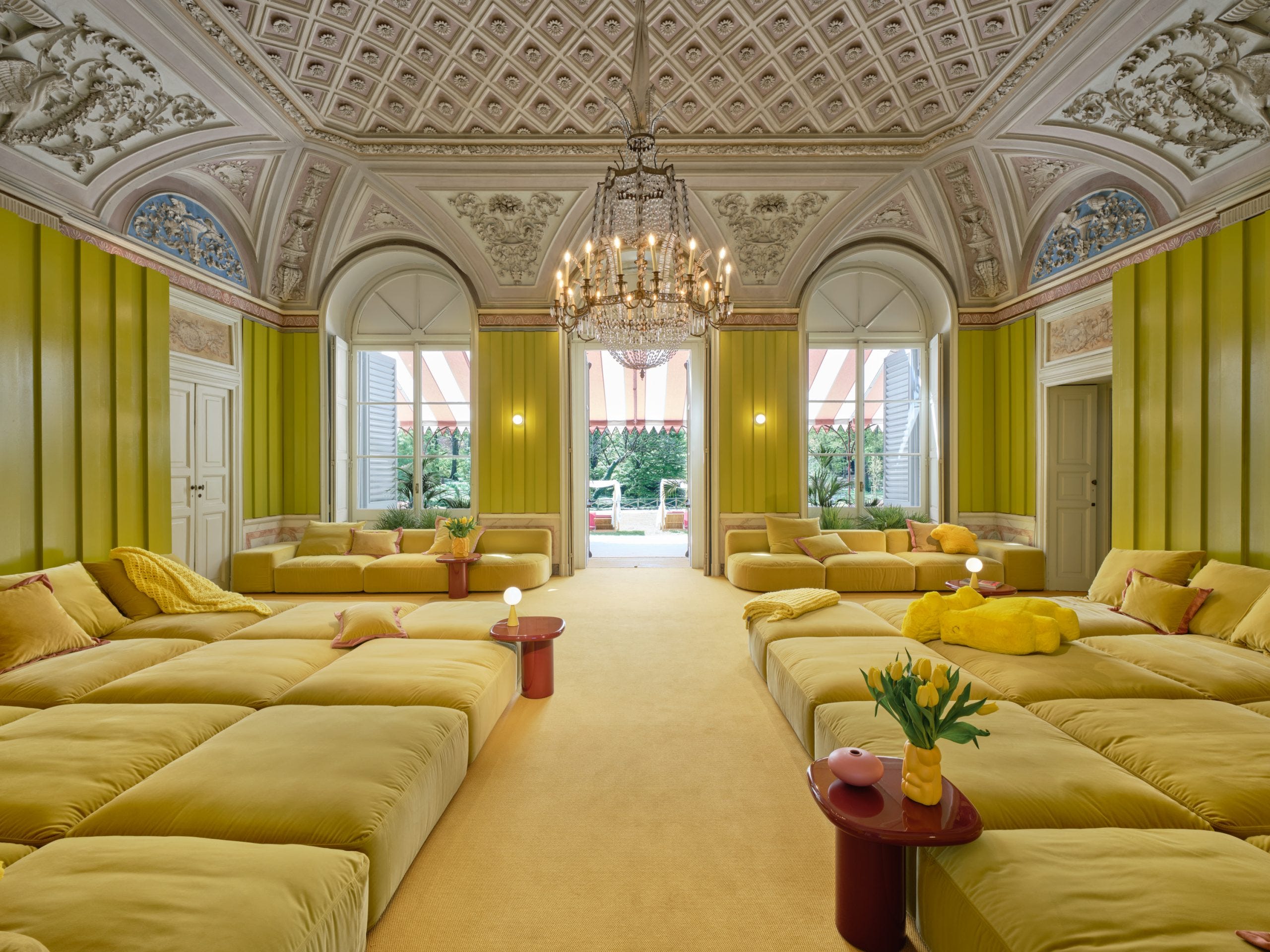
South African furniture studio, Lemon, launched their first outdoor collection ‘A Room with a View’, with yellow lemon upholstery. It was a fun splash of colour in the gardens of Villa Borsani at Alcova, that caught your attention straight away. Meanwhile, yellow was used in ‘Tilocale’ by Matteo Thun & Antonio Rodriguez, inviting us to return to our childhoods and a playful state of mind. Yellow panelling was paired with yellow sofas, blankets and cushions, to encourage us to sit back, lie down and let our imagination wander...
I still won’t be using this colour in my home, it’s much too bright for me, but that’s exactly what MDW is about…pushing boundaries, having fun, and challenging our design ideas. It doesn’t mean we have to copy them, but it does get us out of our heads, looking at our homes and how we live, with a fresh perspective.


Mixed Greens
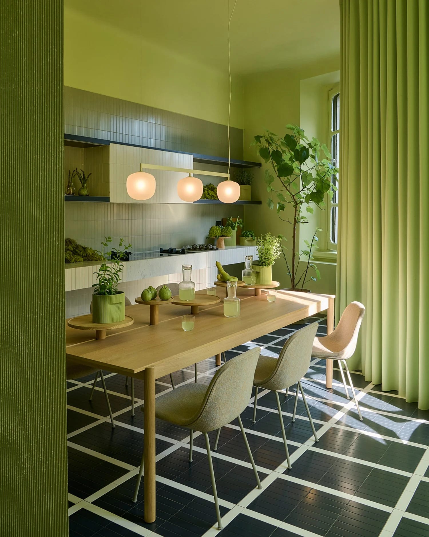
Now everyone is talking about jade green, which is a bright, yellow-green blend, but do you know what I’m seeing? A variety of greens from zingy lime green to a mid moss green. Muuto design apartment invited visitors to awaken their senses and explore spaces inspired by the seasons. The kitchen was a monochromatic green scheme (using different tones of green within one room, from light to mid to dark tones), making for a vibrant, refreshing living space.
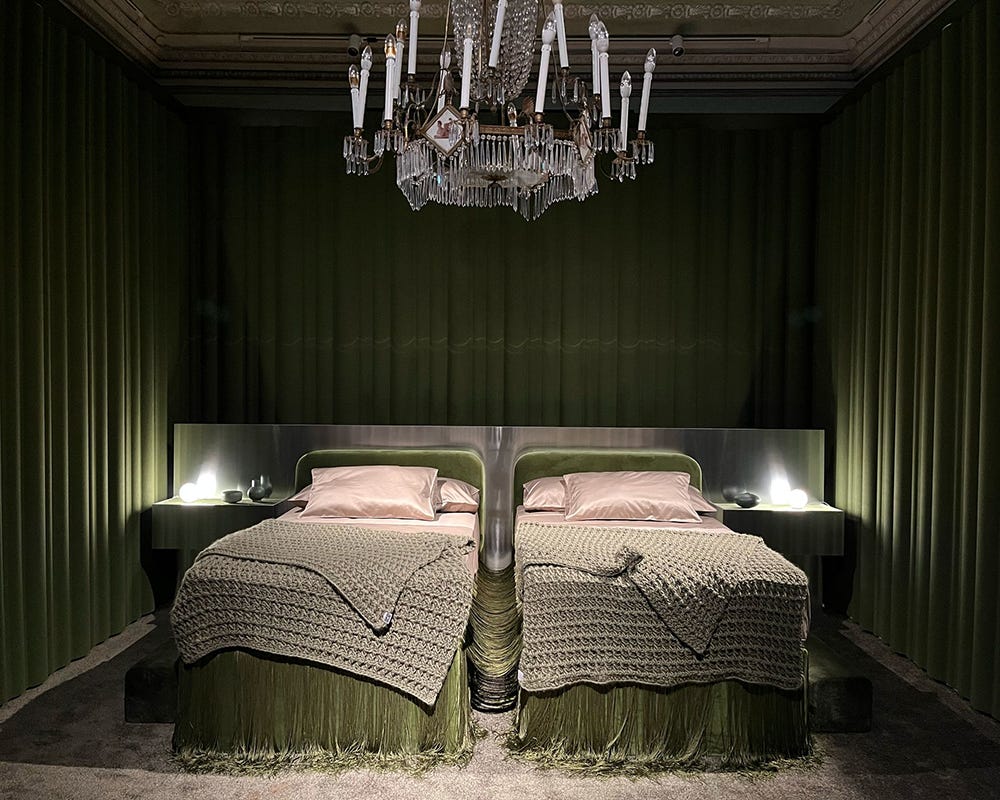
‘Trilocale’ in collaboration with Marie Claire Maison showcased the ‘Tinder Room’, a luscious moss green bedroom designed to invite new ways of experiencing a home. The moss green drapes act as a soft (if somewhat theatrical) backdrop, as well as an acoustic panel to soften sound. The bold contrast with the metallic finishes feels brave but not completely out of place. Perhaps a nod towards what a bedroom could look like in the future…
Flattering Pink
Pink always seems to find its way into interior design spaces, and as one of my favourite colours, I am very happy about it. Pink was limited this year compared to last, however, its biggest presence for me was in two spaces. Firstly, as a flattering bathroom colour. Back to one of my favourite exhibitions, ‘Trilocale’, which showcased an all-pink bathroom (pink walls, carpet, rose-tinted mirrors, chair and textiles). The pink and copper tones brought a softness and intimacy to the space, while the mirrors surrounding the room invited us to take a look at ourselves, both from the outside and within. If you love the idea of a pink bathroom, head over here to read about my favourite flattering paint colours for a bathroom.
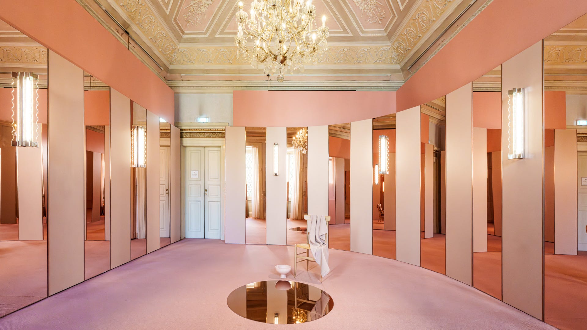
The second space that sang was not an exhibition itself, but the exhibition space. Villa Borsani, home to Alcova, was a beautiful Italian villa, acting as a backdrop to all the lovely interior design pieces. On entering the villa, we were met with marble floors and pink salmon walls. I know what you’re thinking, salmon pink? But trust me, in this historical villa, paired with the original architectural features and modern furniture on display, it was perfection. As the sun shone through and caught the pink in different lights, the colour kept changing. I’ve always said that pink is a neutral, and this is the perfect example of how to use it as one.


Accent Colours
You know the 60-30-10 rule in interior design? In my article last year, I used this concept for breaking down the colours at MDW. If brown, plum, and green are the 60, pink is our 30 and 10 is red, blue and aquamarine.
Since the ‘red thread’ started trending, although this doesn’t specifically mean we have to use red, the colour itself has become key in the interiors world. Red tables packed a punch at Rossana Oralndi’s gallery against plum walls, and red entrance spaces at Elle Decor Italia and Muuto design apartment offered a bold (and brave) welcome to the home environment.


Blues are becoming the new backdrop for many interior spaces. It’s such a versatile colour with the ability to work with neutrals as well as bolder colours and tones. The more I see it, the more I love it. This year, there’s a noticeable theme of monochromatic schemes, where a single colour is layered in varying tints and shades to create a calming mood. It’s a smart way to use bold, saturated colours without overwhelming a space.


So what does this all mean?
Milan Design Week coined this year’s colours as ‘emotionally driven colour palettes’, but honestly, I think every colour choice is emotionally driven. Even if we’re not conscious of it. Colour is a tricky one to treat as a trend or a purely aesthetic choice, because it’s personal. We respond emotionally, psychologically and sometimes even physically to colours. They tap into our memories, cultures, moods, and environments. It’s not something we see, it’s something we feel.
And perhaps what feels new right now is simply a wider recognition of this truth. We see colour before anything else in a room, and its ability to impact how we feel and interact with the space and each other has never been more relevant. Not because it’s new, but because we’re finally paying closer attention.
No holds barred when it comes to colour at MDW. The explosion and the use is getting braver & braver but with refine taste. Looks amazing:)