


My Colour Palette of the Month: Burgundy
A deep dive into the hottest colour this month, including paint pairings and the psychology behind this mysterious hue

‘My Colour Palette of the Month’ is a series I’ve been working on for a while: a deep dive into the hottest colour/s I’m seeing and hearing each month, inspired by the interior world (designers, magazines & events), social media and most importantly, you guys and my colour clients. I usually stick to an inspirational IG post but I thought it was about time I offered something a little more, so we are!
We’ll be focusing on one main colour, then looking at colour pairings based on the look and feel you’re hoping to achieve, to create your perfect palette. So without further ado, my colour palette for this month is all about…
Burgundy
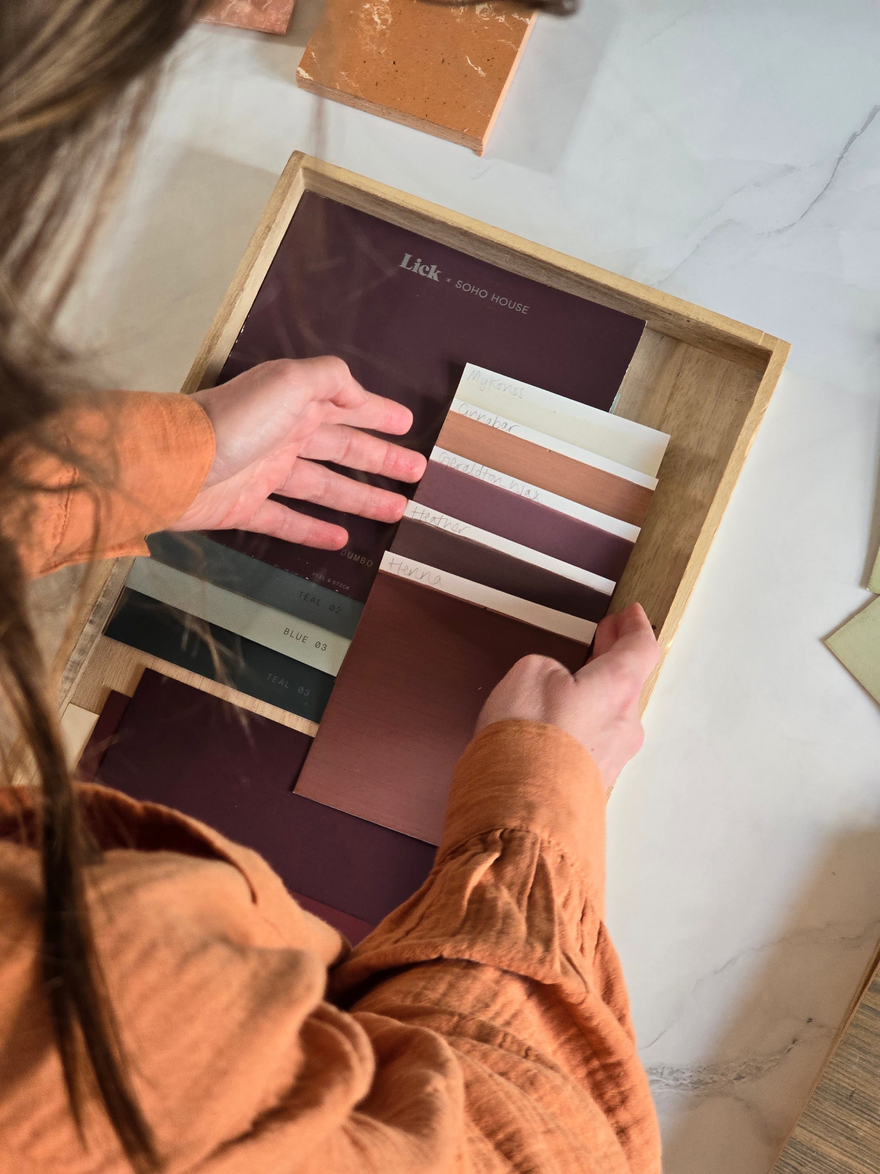
Now it’s no secret that burgundy is back and a couple of my clients have started to ask about this glamorous hue, why it’s on trend and more importantly, how to incorporate it into their homes.
I have always found purple to be a marmite colour - you either love it or loath it. Before studying the science and psychology of colour, I’m going to be completely honest, I wasn’t a fan. But the more I learnt about the varying tones of purple, the more I fell for this colour group, home to grape, heather, aubergine, lavender, mulberry and violet…to name a few.
Colour Psychology
Purple is the combination of red (energy and strength) and blue (integrity and clarity). In colour psychology terms, purple is a colour related to the higher self and spiritual awareness; a colour of inner reflection and calm, especially when used in the right placement, proportion and in the right tone.
To understand more about the concept of colour psychology and its impact on our colour decisions, a good place to start is understanding how we relate to colour. I think one of the reasons I disliked purple when I was younger, was because I associated it with Cadbury’s and Claire’s Accessories. This concept is called ‘colour in culture’ - the idea that different colours symbolise different things in different cultures. And as much I love Cadbury’s chocolate, I don’t want to paint my home in it.
On the other hand, I also associated the colour purple with fantasy and witchcraft books - think of any children’s book with a witch on the front cover and I can guarantee it will be illustrated in purple. This concept according to colour psychology, is called ‘personal colour association’. I associated purple with specific brands and spirituality or witchcraft due to my experience and exposure of that colour.
Now the common theme between these particular purple tones, is that they are all blue-based. Burgundy however, is a much richer, more luxurious hue with undertones of red. This my friends, changes everything. Burgundy is warm, it’s intimate and cosy, rich yet comforting. It will elevate any room by adding a touch of opulence and mystery.
Colour Pairings
Whether you love a dark and moody interior, or a light and airy space, this colour is perfect for adding that extra something special.
For dark and moody schemes, rich with colour, why not pair burgundy with charcoal black, rich red, dark teal or navy. Be brave and introduce texture and pattern to really embrace your favourite dark tones.
If you’re looking for dark minus the moody, keep it tonal with darker and lighter versions of burgundy, like Nicki from And Then They Went Wild has done in this room scheme below. Walls are painted in Red Shade 5 by V&CO Valspar and the woodwork and ceiling in Red Shade 4. Accents of black and brass are the perfect finishing touches to bring this scheme together.

Design & Styling by Nicki Bamford-Bowes. Photography by Lol Johnson.
For a soothing and harmonious feel, keep it tonal like we mentioned before or choose colours that sit next to burgundy (or ‘red-violet’) on the colour wheel, such as red, rust and terracotta. I absolutely adore this colour scheme, it’s earthy yet elevated and has a subtle feminine feel.

Image via Kast
If bold and luxurious is more your vibe, colour drench your space and pair with black, brass, gold or copper finishes. Colour drenching can feel scary, so if you love the idea but it just feels too daunting, perhaps consider doing it is a small room like your downstairs loo or cloakroom - a space where you don’t spend too much time but where a bolder colour will totally transform the look and feel of the space. Get the look with Farrow & Ball Preference Red or Brinjal.
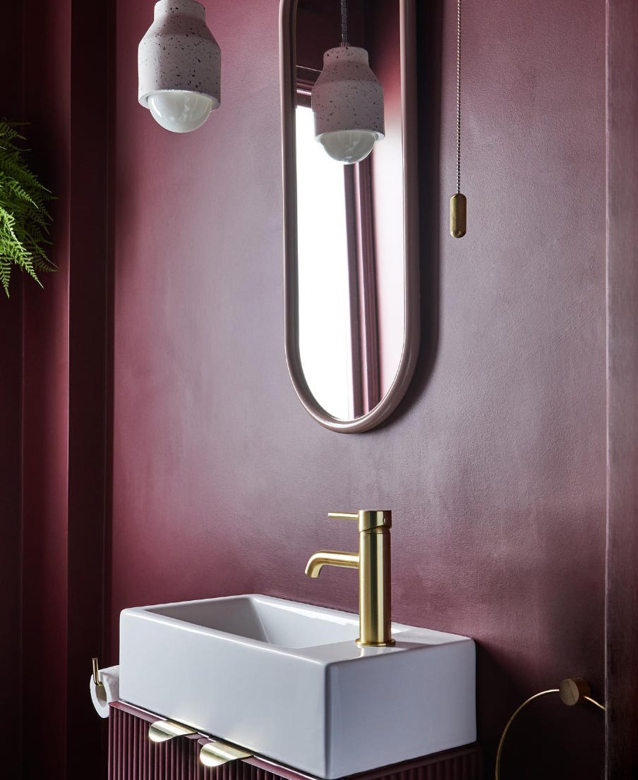
Design & Styling by Nicki Bamford-Bowes. Painted in Farrow & Ball Preference Red.
Perhaps you prefer lighter, brighter spaces and are looking to use this colour as an accent instead. You might want to paint your built-in units or woodwork, or keep it simple with textiles and smaller, decorative objects. Take inspiration from Jess Hurrell’s study with her gorgeous burgundy bookcase painted in Arras by Little Greene, paired perfectly with cushions, rugs, artwork and even a gorgeous marble fire surround. Opt for warm, creamy neutrals for the walls and ceiling, and burgundy, black and blue accents for the ultimate sophisticated colour palette.
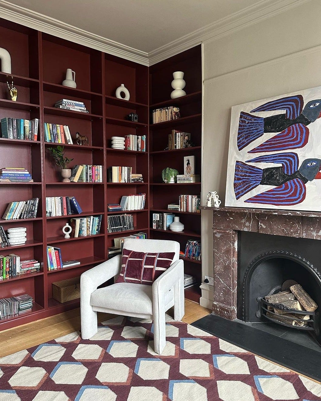
Design & Photo by Jess Hurrell
I would love to hear your experience with purple and more specifically, with burgundy. The more I get to know this colour, the more I fall in love. What do you think? Love it or…?
Gorgeous!