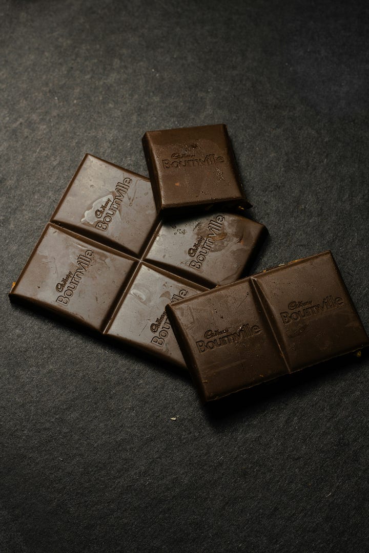
My Colour of the Month: Brown
Join me for a deep dive into one of the best colours that are set to rule in 2025, including how to decorate with this earth hue and my go-to paint shades
This month, I’ve had four colours that keep cropping up over and over again: browns, rich reds, moody aubergines and deep greens. I did a little poll on Instagram to see which colour you guys would love to learn more about, and (as if the title hasn’t given it away), brown came up trumps!
Now, I wrote about brown earlier this year, as it was the standout colour at Milan Design Week, but today we are digging a little deeper, looking at the various tints and shades, where to put them and what to pair them with.
Colour Psychology
According to the Psychology of Colour, brown is a primal colour. It’s a colour that represents the earth, and in turn, safety, stability and strength. Brown is one of those colours whose characteristics can dramatically change depending on the quantity and placement in a space. Used successfully, brown can feel cosy, comfortable and warm - perfect for any home interior. On the flip side, when too much or the wrong tone is used, brown can feel heavy, dull and even lifeless. So, how can we use brown successfully to celebrate this earth hue and inject soul into our spaces?


How to Decorate with Brown
Brown has always been part of our interior colour schemes, from wood finishes and furniture, both of which are quite easy to get right. This year, however, it has crept into our paint colours and this can feel more challenging to work with.
I thought a good place to start might be differentiating between the various types of brown, because let’s face it, there are thousands. So, to simplify this colour group, I’ve divided my interior ideas into tonal groups: soft, mid and deep, dark browns, so hopefully there’s something for everyone!
Soft Tones
Soft browns are the lighter end of this colour group - the not-too-light, not-too-dark hues. These include the milky browns, tan and caramel colours and even deep beiges. Soft browns are a great place to start if you’d love to dabble in brown but the thought of going all-in feels too scary.
This tonal group is perfect for hallways, guest bedrooms, attic rooms, living rooms and home offices (you could even apply them to wood panelling or feature walls too!). Now, I think soft brown tones can be considered neutrals and consequently, I wonder if we might fall into one of two schemes when decorating with these lighter browns. One is a tonal colour scheme - think layers of different browns and neutral colours, paired with natural materials for the ultimate calming and relaxing space. A fabulous example is the thoughtful scheme below painted in ‘Tea & Toast’ by Atelier Ellis - a soft, mid-brown paired with dark chocolate accents and natural flooring and furniture. Comfy and cocooning.
The other scheme is pairing your brown with ‘actual’ colour (aka not neutrals), to give it a new lease of life. Fiona de Lys, a fellow colour consultant from the UK, demonstrates beautifully below how to combine soft brown tones with colourful accents in a sanctuary bedroom space. Here, Fiona was inspired by the dusky skies of Liguria in Italy. She used ‘Mummy’ by Edward Bulmer on the walls, pairing it with muted lilacs, mauves, blues and deep damsons.
‘I wanted a strong colour that ‘warmed’ to the afternoon sun, (when we have it!) and balanced the purple in a calming way. This light brown feels serene and it’s a combination that works for me, achieved by making the purple warmer.’
The undertones of green in ‘Mummy’ instantly elevate this brown hue and balance the south-facing sun in Fiona’s space. It’s a colour that feels intimate and yet acts as a quiet backdrop to the surrounding colours, allowing the art and decor to do the talking.

Get the Look…
Mummy by Edward Bulmer - warm and inviting
Chocolate by Edward Bulmer - milky and velvety
Beige 02 by Lick - earthy and supportive
Bullrush by Bauwerk - hygge in a paint pot
Zumai Atelier Ellis - neutral brown
Tea & Toast Atelier Ellis - deliciously cosy
Topi by Paint & Paper Library - soft and neutral
Mid Tones
When I talk about mid browns I’m talking about browns that feel slightly richer than our softer tones, but not as deep or dark as chocolate brown. I’m talking grey-based dusty browns or rich, yellow-based browns. Imagine the colour of a strong tea, light oak, raw umber or cedar.
Mid tones are the perfect colours if you’re looking for a restorative feel in a space. A space that feels deeply connected to the outdoors. I love using these tones in living rooms, bathrooms, bedrooms and studies. If your space is dazzled with sunlight, lean into the grey-based browns. If you have a cool, darker room, reach for the warm yellow and red-based mid-tones.
One of my favourite mid-tone spaces of the moment, is Australian-based artist and sculptor Liz Bowtell’s living room. I’ll pop a photo of it below and let you take a moment to soak it in before we dissect why this colour looks sooooo good.
Gorgeous, isn’t it? Liz has created a monochromatic scheme by pairing ‘Tea’ by Bauwerk, with a black charred console table, coffee brown and burgundy wall rug, walnut cushions, and a light oat armchair. The perfect colour scheme for a cosy and calming space, with enough contrast to add personality.
“When I found the colour 'Tea' I didn't necessarily classify it as brown, but as a perfect medium neutral. Everyone who has come by has commented on how warm, cosy, inviting and comforting this space is. I love this because it really reflects what I was trying to capture - a relaxing, safe space that feels like a hug.”
What I love about Liz’s ideas for this space (and mid-tones in general) is the possibility to lean into the lighter or the darker side of brown, depending on her mood…
“I'm generally drawn to a dark and moody cave-like vibe - this is what makes me feel relaxed. If I do feel like emerging from hibernation, the space can easily be lifted and lightened depending on the lighting and styling. ‘Tea’ really is an all-rounder colour that you can morph into so many variations and lean into the lighter or darker.”
For a more playful scheme, why not take your dusty brown onto the ceiling or woodwork and pair it with a softer colour on the walls? If neutrals and monochromatic schemes aren’t your thing, pair with soft blue, green or a punchier teal.
My Top Tip: Use the undertone of your brown to inspire the colours in your space. If you’ve fallen for a pink-based brown, introduce variations of red and/or pink into your colour scheme to ensure it feels harmonious.
Get the Look…
Tea by Bauwerk - natural and earthy
Axia by Atelier Ellis - damon-based brown
Dead Salmon by Farrow and Ball - pink-based brown
London Clay by Farrow & Ball - warm and charming
Scullery by Little Greene - understated and effortless
Affogato by Little Greene - rich and uplifting
Attic II by Little Greene - grey-based brown
Dark Tones
Dark browns are your richer tones, such as chocolate, burnt umber, maroon and burgundy-based browns. For me, these are the main players in the brown colour group. These are great for dining rooms, living rooms, snugs, dens or TV rooms, bedrooms, statement wardrobes, kitchen cabinets and woodwork. These browns are your go-to if you’re looking for drama, moodiness or just a deep, soulful hug.
The key to choosing your dark brown is to look at the undertones (do I sound like a broken record yet?). Are they purple, red, green, grey or even black? This will help you determine how they respond to the light in your space and, therefore, how this colour will feel on a larger surface area and with your surrounding finishes.
Plum-based browns, I have to say, are some of my favourites - they have a character and personality that speak for themselves. I asked Cassandra, the founder of Atelier Ellis and creator of ‘Fallen Plum’ shown above, the story behind this intimate hue.
‘Fallen Plum is evocative of both seasons changing - and time in the greatest sense. It is one of our most complicated colours and our most enduring. There is a familiarity in it which is truly comforting to live with.’
This rich burnt umber with notes of red feels hand-picked straight from the outdoors. Nature’s neutral perhaps..?
Now, I want to finish off on what feels like an indulgent decor idea. This is what I would do if I lived in a Mediterranean villa - pair my chosen earth hue with natural elements, perhaps with hand-dyed textiles, linen or cotton fabrics, foliage and exposed woods. Casa Pernoise is a holiday house in Provence and they have created an intimate snug with ‘Cacao’ by Bauwerk that makes you want to sink into the sofa, put your feet up and never leave. Ahh, don’t mind I do…

Get the Look
Cacao by Bauwerk - deep with a subtle red undertone
Chestnut by Bauwerk - rich with a slight red undertone
Fallen Plum by Atelier Ellis - rich and evocative with notes of plum
Jam by Atelier Ellis - deep, dark with black undertones
Brown Betty by Atelier Ellis - a nostalgic brown
Cola by Farrow & Ball - red-based brown
Deep Reddish Brown by Farrow & Ball - warm and welcoming with lots of red pigment
So whether you’re dipping your toes into this earth hue or you’re ready to go all-in, I hope this article has given you the confidence to choose the right brown tone for you and your home. If there’s another colour you’d love to learn more about and need help decorating with, just let me know in the comments below, and I’ll work on it for the next feature! Until next time, C x


Hi Charlotte, how can I correctly identify undertones? Some paint brands bring this info, while others don’t. And even when they bring, how can I train my eye to see it? 😉