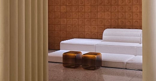
Colours to Fall in Love With at Milan Design Week 2024
A round-up of colours inspired by Milan Design Week, what they mean and why they look so good
Gosh where to begin! Milan Design Week is a melting pot of interior design inspiration; the mecca of design shows! Every year it seems to get bigger and better and as always, I spent this week on the hunt for colours.
This year seemed peppered with more colours than ever and it almost left me wondering if I’d be writing a bit of a ‘free for all’ article, but the more I looked the more I noticed a core palette of timeless hues that really stood out. Now I’m not a trend forecaster, but part of my job is to spot ‘repeated’ colours. I’m avoiding using the word ‘trending’ here because I think these colours are truly timeless: they’re colours we already use but putting them in the spotlight gives us a new-found appreciation for them and fresh inspiration for how to introduce them into our homes.
Umber
First up, is Umber. I was pretty excited about this, as it’s a colour I predicted back in January (more about that here). Umber is a natural earth pigment that can vary from yellow, red and even green-based brown. Raw umber has a darker feel while burnt umber leans more towards a brown with red undertones. Each variation is earthy, rugged and raw, while simultaneously feeling cosy and warm. We saw umber in the form of a painted ceiling (paired with lilac walls), a circular table (paired with black chairs), meditative armchairs (against a backdrop of cream walls), stoneware tiles and clay-painted linens.
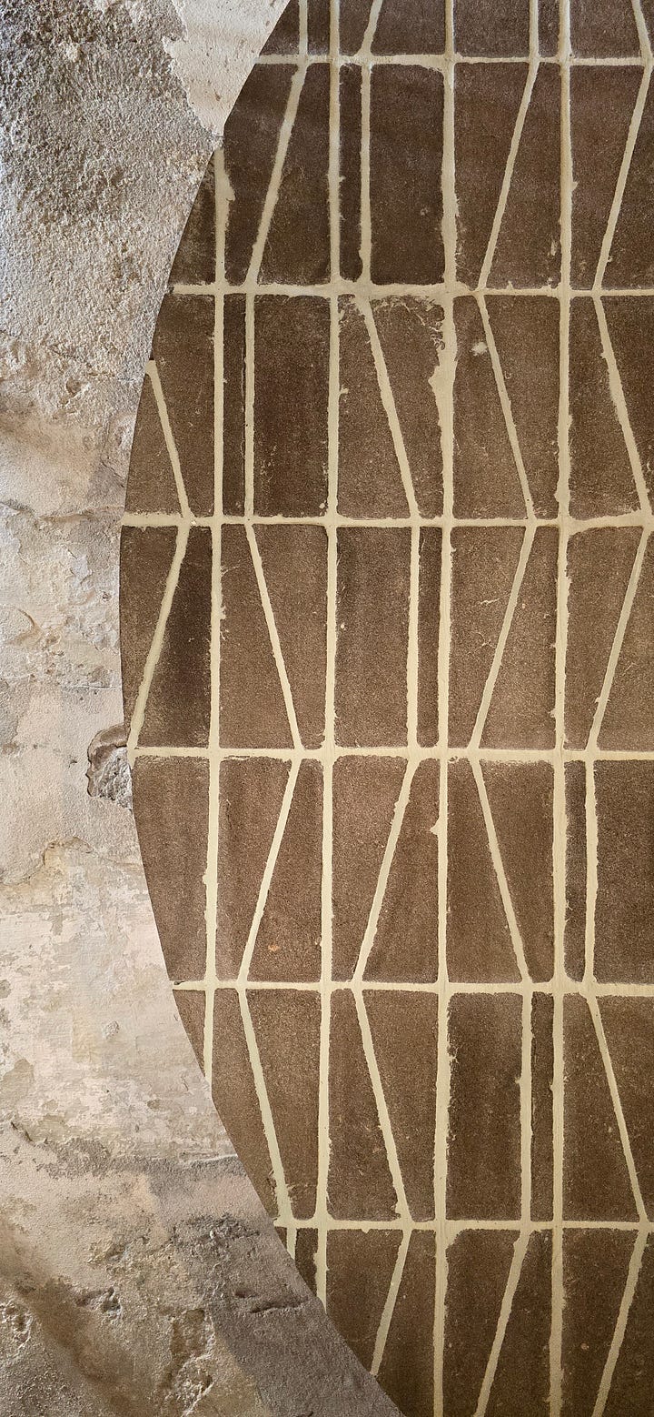
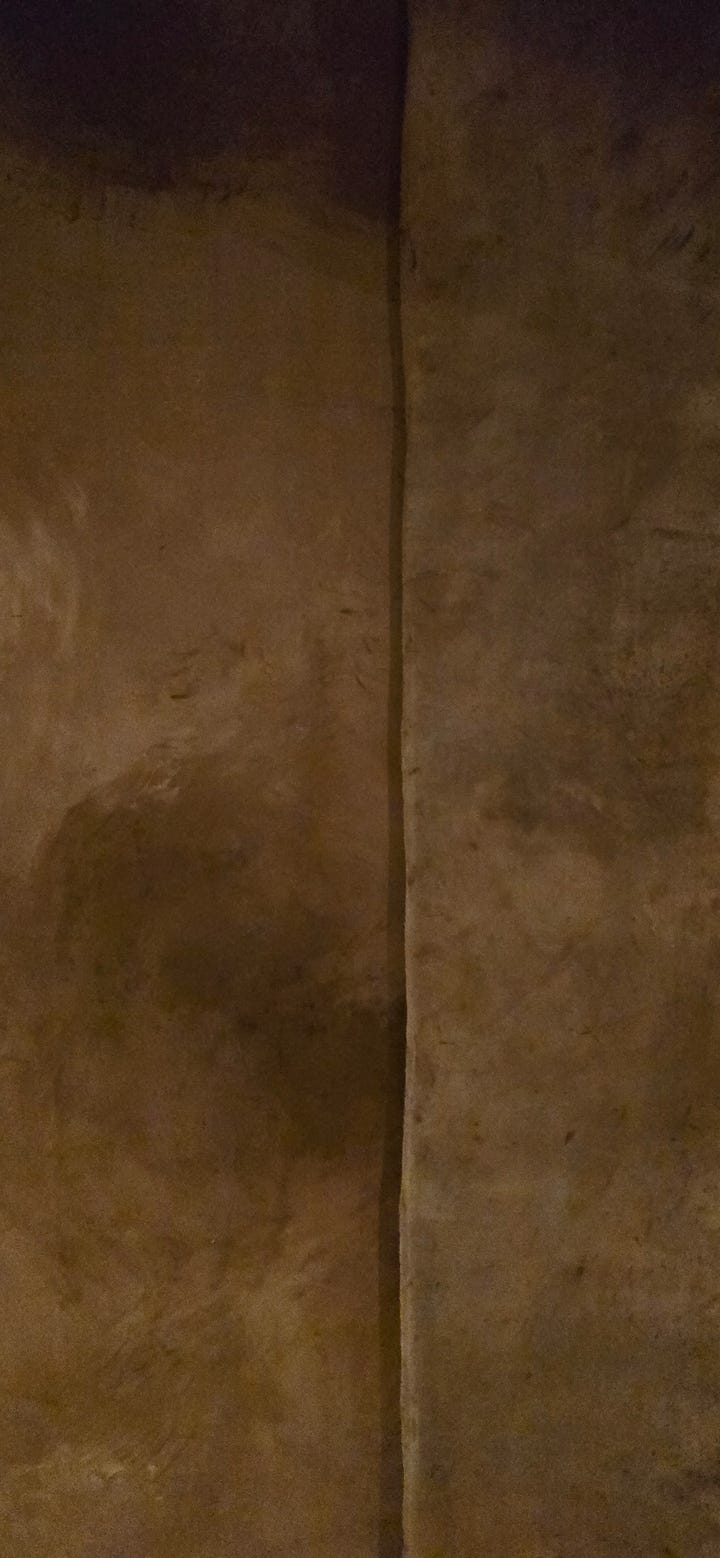
Umber by Terraformae & Terra Rossa
Cream
Magnolia is back and I’ve got to tell you, it’s looking good. From creamy whites to subtle beiges, this light, warm neutral is here to stay. Elle Decor Italia showcased an all-cream tonal room inspired by lime, with terrazzo flooring, clay paints painted on linen, cream leather sofas, sculptured vessels and round tables with an accent of umber. Perfection one might say.
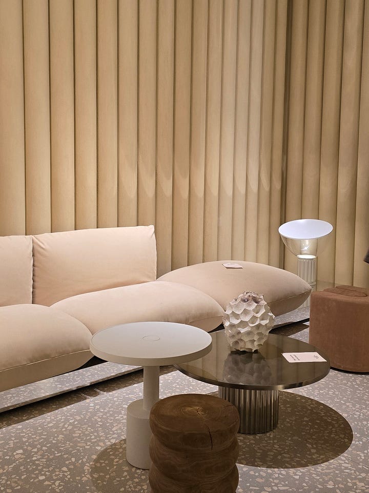
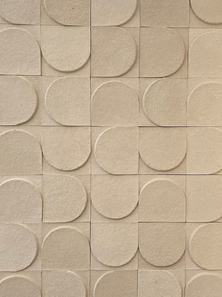
Cream by Elle Decor Italia
Terracotta
The theme this year at design week was Materia Natura, exploring the connection between nature and materials. Consequently terracotta was one of the most explored materials and we saw it being pushed to its boundaries. Elle Decor Italia showcased a living room space lined with terracotta wall tiles and terracotta terrazzo, while Milan - based designer Cristina Celestino and Fornace Brioni presented ‘Grounded’, a tour into the world of terracotta tiles and ceramic pots.
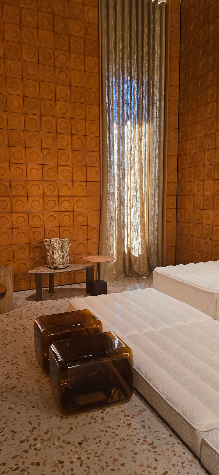
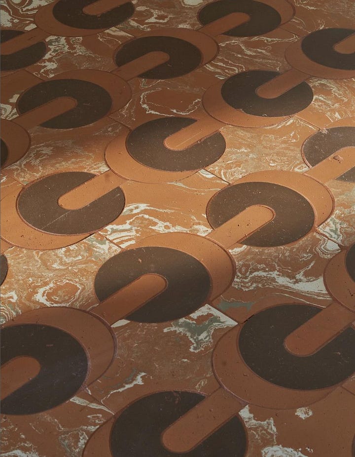
Terracotta by Elle Decor Italia & Cristina Celestino
Terra Rossa, a collective exhibition by Barcelona-based designers explored the earth as a primordial element. The designers all designed and crafted terracotta water jugs (càntir) as a way to reinterpret the ‘red earth’ that the Mediterranean is so famous for. Curator Júlia Esqué sums it up pretty beautifully: “The earth provides raw ingredients and the clay transforms them into vessels that enhance the experience. These objects become channels that connect us with the land and the artisans. They become vessels of meaning, cultural and artistic, reflecting the creativity and craftsmanship of societies throughout history.”
Accent Colours
You know the 60-30-10 rule in interior design? Well let’s apply this to MDW colours. While umber, cream and terracotta are the 60, 30 saw powder blue and earthy pink, while 10 saw olive green, thyme green and lilac. I felt like most of the accent colours have been floating around the design world for a while, but it was the colour combinations and the materials of some of these accent hues that got me excited.
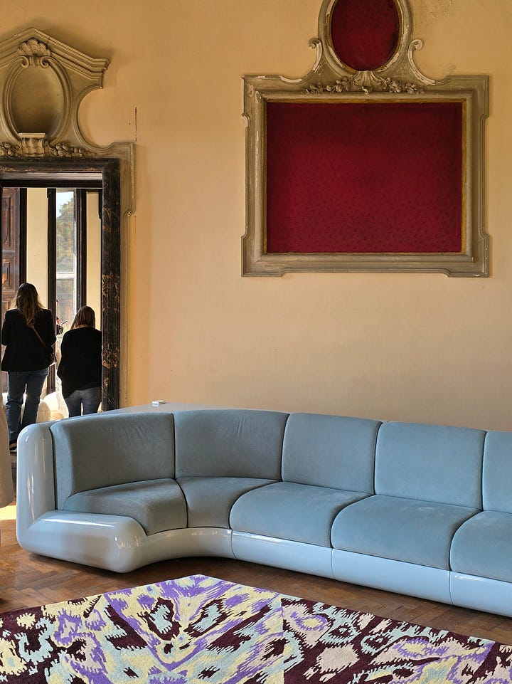
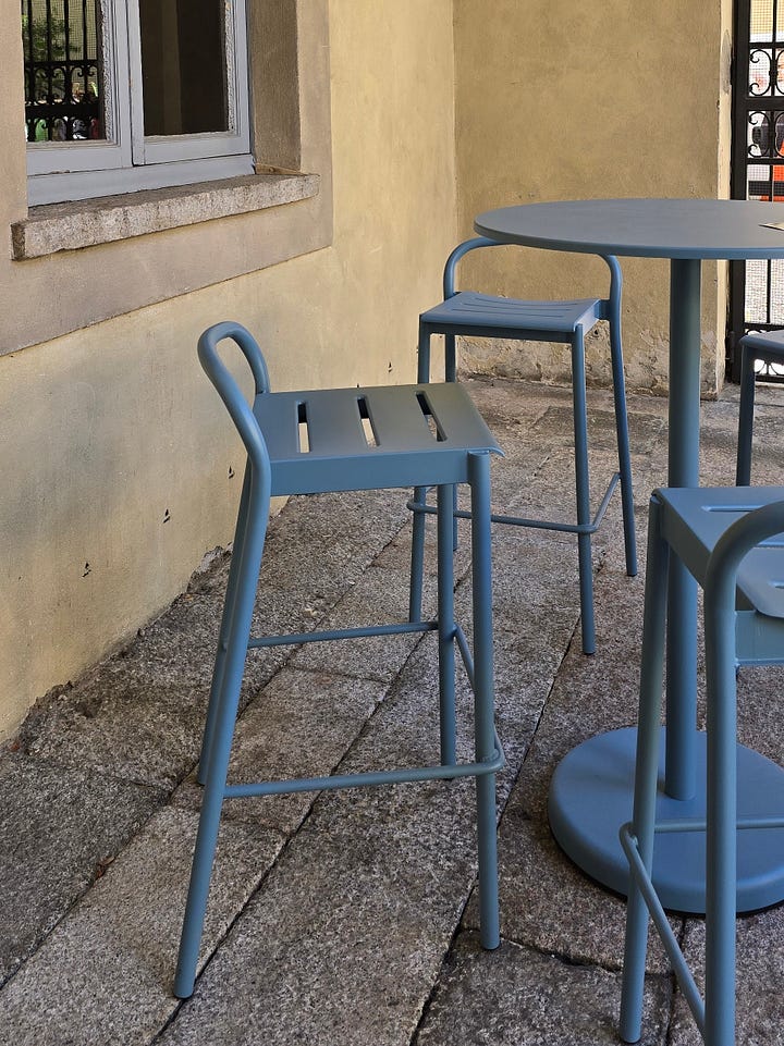
Powder Blue at Alcova & Poggenpohl
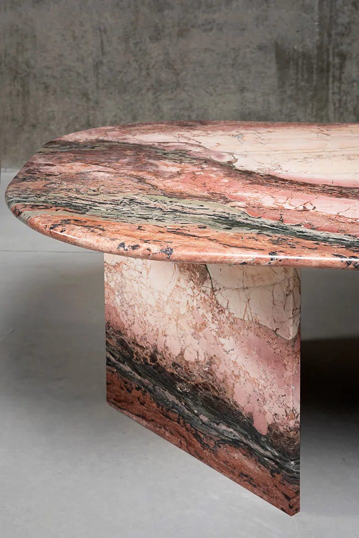
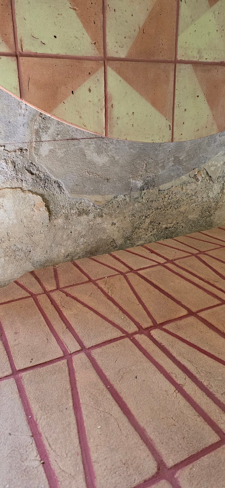
Dusty Pink by Breccia Medicea (photo by Nicola Gnesi) & Terraformae
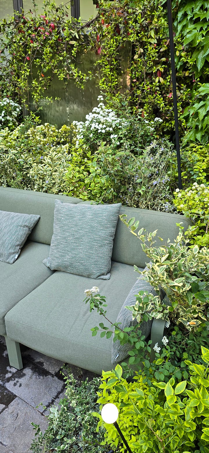
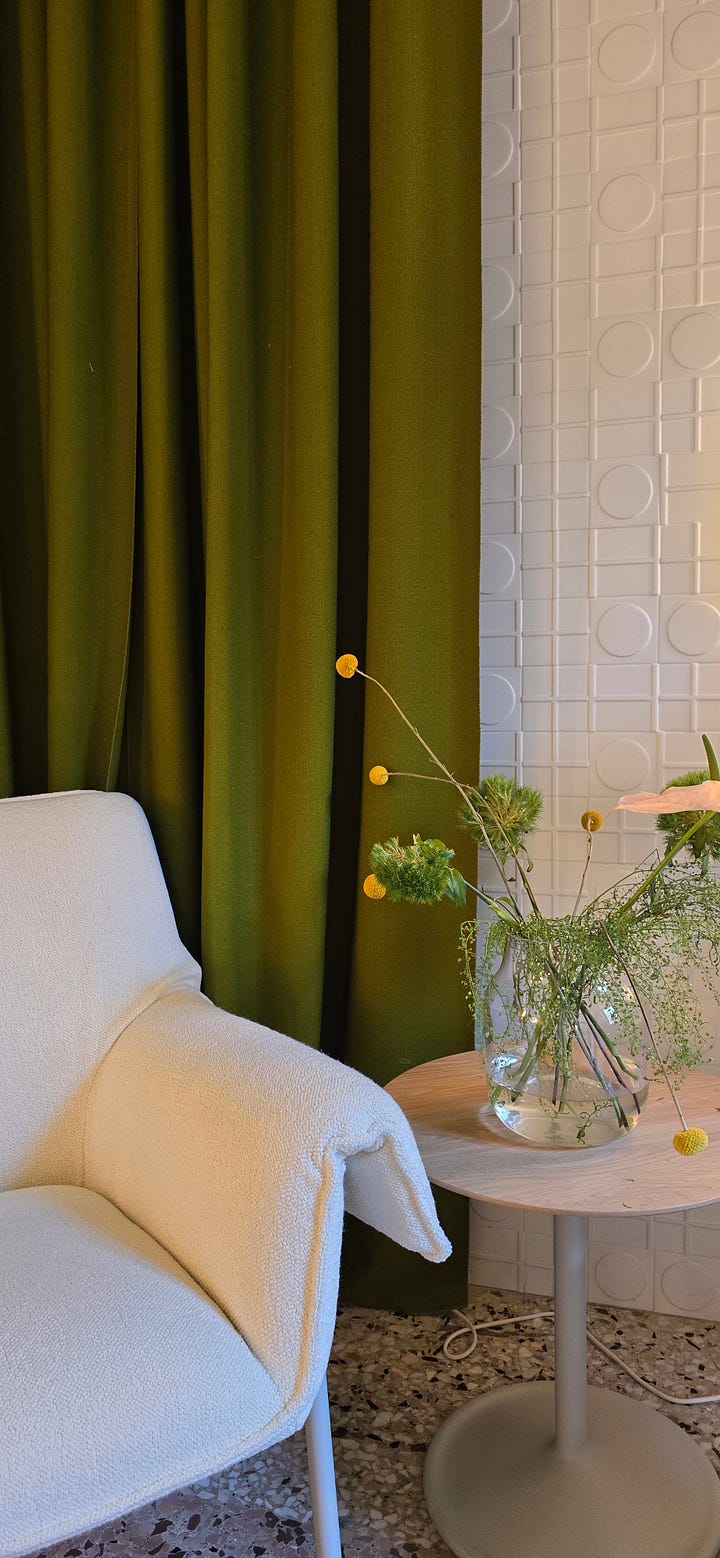
Thyme Green at Nardi Outdoor & Olive Green by Muuto
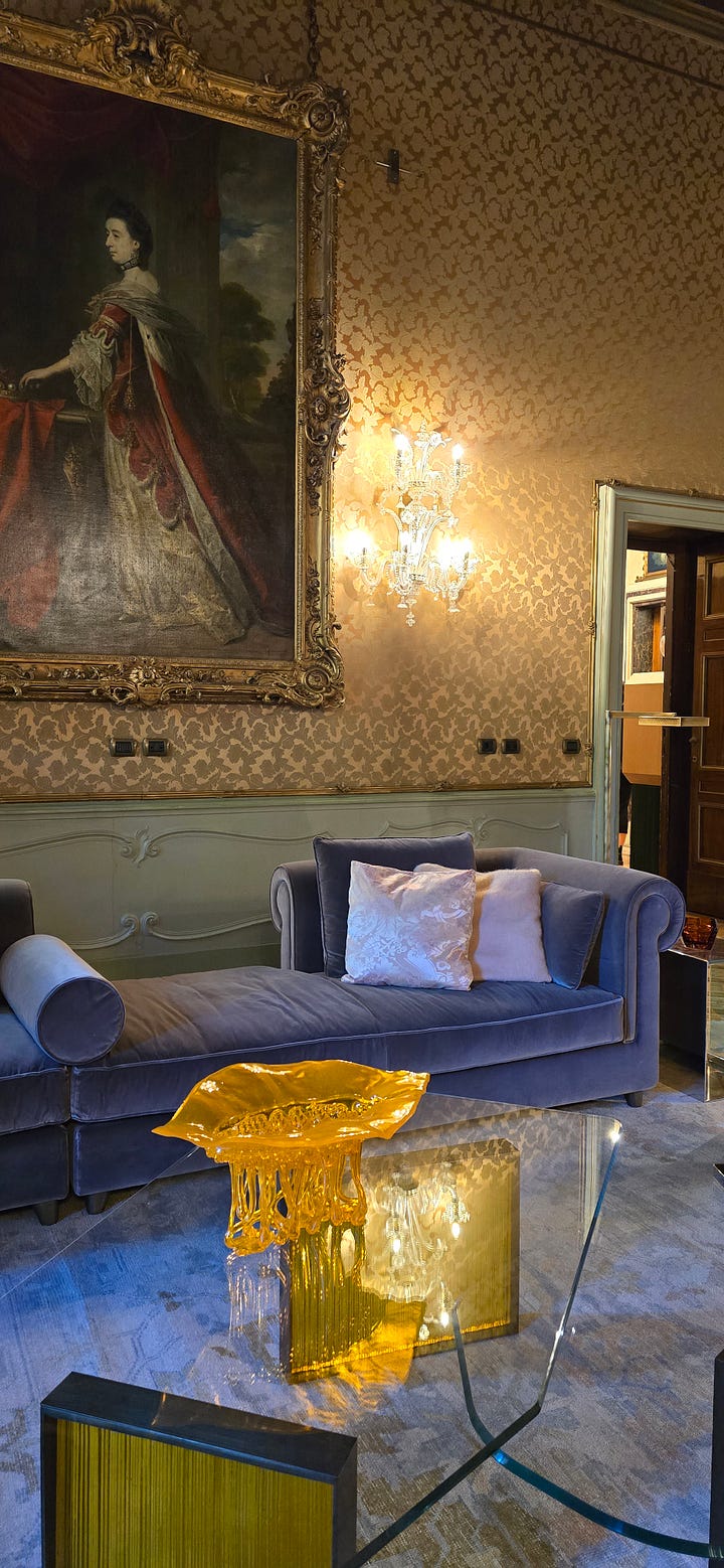
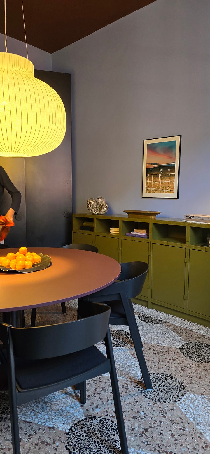
Mauve & Ochre at L’Apartamento Artemest and Olive Green & Lilac at Muuto
So what does this all mean?
While each exhibition explored different colour groups, from bright pastels to pale neutrals, there was a subtle theme that I felt built the foundation of design week: grounded colour schemes. Colours that root us to our heritage, community and culture. Colours that make us feel safe in a world of uncertainty. For me, that looks like warm, cosy and earthy colour palettes, with umber, terracotta and dusty pink at the forefront. But for some, maybe that’s playing with brighter colours or contrasting pastels.
Colour this year took on a role of itself: the role to protect and comfort, to create spaces that make us feel good and encourage moments of reflection and regeneration.
I’ve decided I’m going to write separate posts about the top colours because I think they deserve a bit of the spotlight, don’t you? We’ll be exploring the variations of each colour and how to use these new hues in your home. So with that in mind, which colours are you falling in love with…?

