


Choosing Colour for an Open Plan Kitchen
How to choose the perfect paint colours (and where to put them) for the trickiest room in your home, regardless of lighting, layout or style + a paint shopping list

Now, I'm a huge fan of open-plan living. Maybe because we don’t have children, maybe because I work from the kitchen and that’s where we get the best light in the house, or because Dario (my other half) is Italian so we spend a lot of time cooking, eating and hosting. Our open-plan kitchen and living room space is without a doubt the heart of our home and where we spend nearly all of our time.
Choosing paint colours for an open-plan space is probably one of the biggest pain points for my clients. Can we use different colours on different walls? What colour to paint the ceiling? The cabinets? How do we zone the space? How can we introduce colour that works in the back of the space where there’s no natural light as well as the front of the space that’s bathed in sunlight? If this sounds familiar, come with me and let’s take a look at how we can get the most from our kitchens, without compromising on colour.
Don’t be afraid to use colour
Kitchens, for many of us, are the most used room of the home, making this space more important than ever when it comes to choosing colour. We ask a lot of these spaces, whether you're a home cook at heart, love entertaining or take your Zoom calls from the kitchen table, this is where the magic happens. This often means that we stick to 'safe' colours because we are scared of getting it wrong, getting bored of it or simply the larger surface area to paint means it’s more expensive to decorate. But do you know what I think? As the most used room, this is precisely where you want to introduce personality and colours that make you feel good.
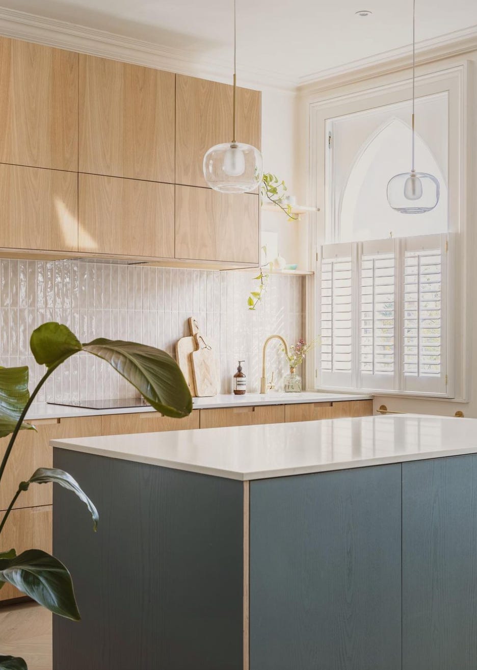
1. Kitchen Cabinets and/or Islands
I find a great starting point when it comes to colour in the kitchen is your cabinets. If you have a new built-in kitchen, you might find you're limited to certain colours or paint brands (in which case you might be overwhelmed!), but this doesn’t mean they have to be safe or boring. And if you have great existing units, and simply want to repaint them, well, the world is your oyster!
Introduce the boldest or darkest colour on the kitchen cabinets to make this one of the focal points in the room. This is the perfect canvas for injecting your personality and adding a bit of 'you'. Whether you love rich burgundy, olive green, buttery yellow, bright orange or powder blue, any colour will work on the cabinets (the key is pairing it with a cohesive wall colour). Don’t be afraid to go for a mid-dark cabinet colour to ground the space or if that feels scary, why not consider mixing and matching with a darker colour on the lower units and a lighter colour on the top, just like Tuscan brand, Homewood Bespoke Kitchens, has done below? I love their confident use of colour, pairing slate and off-white cabinets against a backdrop of sage green. Don’t mind if I do!

If you’re lucky enough to have an island, perhaps consider wrapping your boldest colour on here instead, to draw the eye around the space. One of my favourite mix-and-match combinations is this gorgeous kitchen below by Lily from Designing Lily’s Pad. Lily combined exposed wooden cabinets with a teal island and light pink walls, creating a calm, cosy yet curated kitchen space.
2. Colour Drench Your Walls and Ceilings
Another trick I love using for open-plan spaces is colour drenching. Oh yes! Wrap your walls and ceiling in the same colour. Why? If you have vaulted ceilings, this will make the angles recede. If you have low ceilings or no period features, it will create the illusion of more space and ensure the fifth wall (the ceiling) feels considered and part of the room scheme instead of a leftover blank space. If you have tall ceilings and/or period features, colour drenching can still work really well, wrapping the room in a newfound warmth or creating a contemporary twist on a period property.
Gary Oakley’s open-plan kitchen space is possibly one of my favourites. I don’t have permission to feature his kitchen, so I’m just going to add a link to it here, because it’s SO drop-dead gorgeous. With a grounding green on the cabinets, Gary injected texture and colour on the walls with limewash in Bauwerk Dune. Dune although considered a neutral colour, has deep pigments of umber and ochre, adding an extra layer to your kitchen colour scheme.
3. Create Zones with Accent Colours
Zoning is the key to defining individual spaces or moments within an open-plan room and one of the easiest ways to do this is with colour. But before we dive into ideas, it's important to understand first how you use a space and who uses the different areas. Do you love cooking and spending lots of time in the kitchen area? Are your kids doing homework at the table? Do they have a play area in here? Do you have a favourite spot you like to sit and watch the world go by? Or maybe the way it’s being used isn’t working for you, and you’re looking to introduce zones to encourage new behaviour? Ask yourself these questions and get into the nitty-gritty of the how and the why before we start with the what.
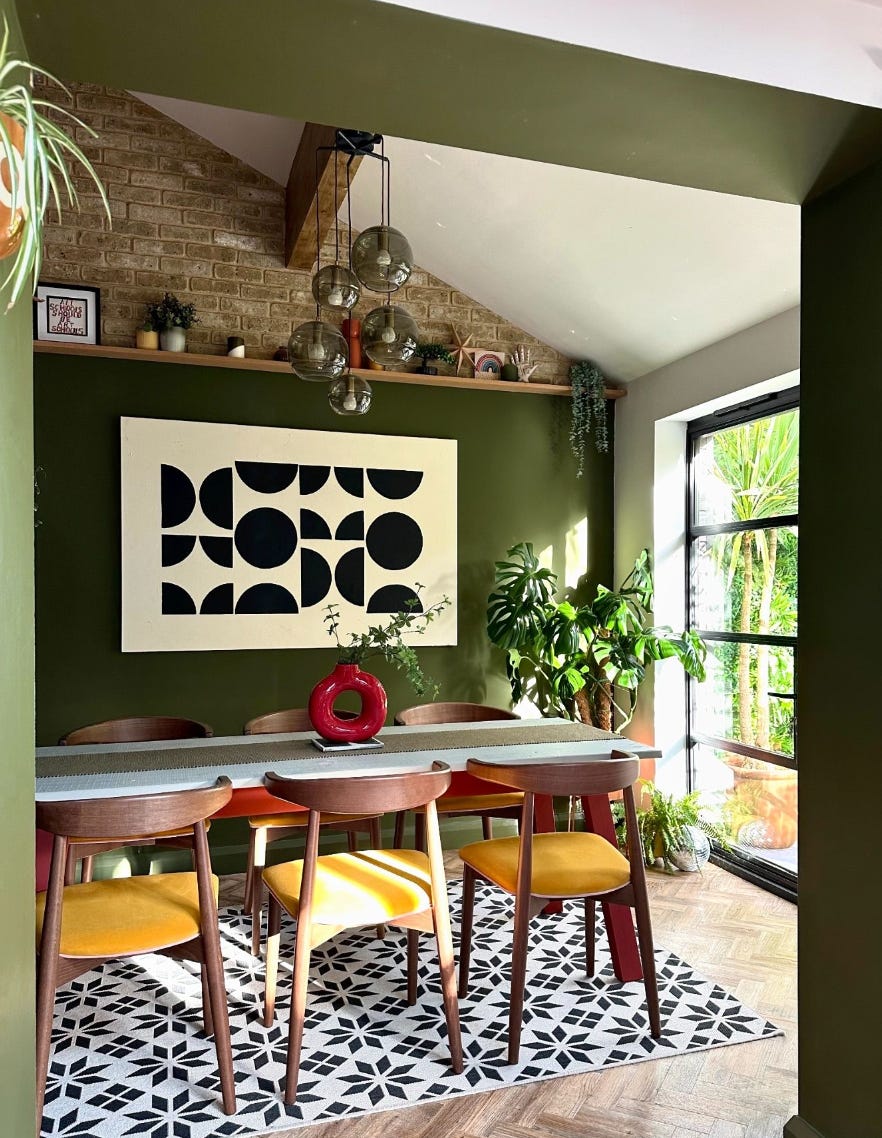
One way to create zones is with feature walls or focal points, using an accent colour to define an area or create a subtle connection between two zones. Steph from House On The Corner has executed this perfectly with an olive green feature wall in her dining room. By using the same colour in the archway, Steph bridges the gap between the dining space and kitchen, bringing these two zones together.
Feature walls aren’t for everyone and I often find them a bit of a marmite subject. You either love them or you hate them. If you’re the latter, another easy way to create zones is simply using your homeware or furniture.
One option is to use rugs to create and define an area. Although not paint colour per se, your rug still plays a part in your overall colour scheme. Why not pop a rug under the dining table or under the sofa and coffee table to separate the cosy lounge area from the busy kitchen like Olive from This Northcote Home has done below? Don’t be afraid to go big, tucking the rug (literally) under the sofa and any armchairs. This will ensure your rug brings this zone together and doesn’t just feel like another accessory.

4. Let There Be Light
Another important aspect when it comes to choosing colour is the light - both natural and artificial. While lighting is important to consider in every room, it can often feel the most challenging in an open-plan space. I often find my clients (especially in the UK) are faced with this gorgeous big room, that feels bright and light by the windows and doors that lead out into the garden, and cold and dark in the back where the natural light doesn’t reach (sometimes known as the middle room in a Victorian property).
So how can we choose the right colours based on the light? Lighting is essential to setting the mood in a room so I think it’s really important to ask yourself what mood would you like to create in the space. How do you want to feel when you use this room?
If you’re looking to acheive a deeper, cosier mood in the kitchen, lean into your mid-tones just like we saw earlier with Homewood, who wrapped a gorgeous sage green on the walls and ceiling. If your kitchen receives lots of direct sunlight, consider a cooler-based colour that will balance the golden light, like a grey-based neutral, blue or green.
If you prefer a light and airy space, but your open plan kitchen feels dark, lean into colours with warm undertones. Warm neutrals will give you the light you’re looking for, but prevent the space from feeling cold. If you have a middle room to tackle and there’s a natural break in the walls between this room and the kitchen diner, consider embracing the darkness and opting for deeper colours. If there’s no natural break, keep your colours light but avoid white or colours with cool undertones. Instead, consider light beiges, taupes, and pinks (keep scrolling for my paint shopping list).
My top tips: In these darker rooms or zones, take advantage of artificial lighting and layer table, floor and wall lights and lamps for the ultimate mood-setting spaces. Why not introduce a mirror in the darkest corner or opposite a door/window to allow the natural light to reflect around the room?
Your Paint Shopping List
Now, I didn’t just want to share ideas about choosing colours, I also wanted to give you a shopping list of different wall colours to explore. So without further ado…
If you're looking to keep your kitchen light but warm, lean into warm whites and light neutrals with undertones of yellow, brown, red or pink. If you’re averse to cream and beige, try my favourite pink-based whites (see below) that add that warmth and glow while avoiding anything remotely magnolia.
Red-Based Light Tones:
Rose Tinted White by Edward Bulmer
White 06 by Lick
Dimity by F&B
Dream or Serene by Bauwerk
Yellow-Based Light Tones:
Safe Play by COAT
Pointing or Tarrow by F&B
Raw White, Bone or Calm by Bauwerk
White 03 or White 05 by Lick

If you’re looking for light colours with cooler undertones, take a look at these grey and green-based neutrals below.
Grey-Based Light Tones:
Safe Play by COAT
Slipper Satin by Farrow &Ball
Intention by Bauwerk
White 04 by Lick
Green-Based Light Tones:
Quiet by Bauwerk
James White by Farrow &Ball
Green Stone - Pale by little Greene
100% Maybe by COAT
If instead, you’re open to more colour on the walls, why not explore a mid-tone...a colour that’s not too light and not too dark to create a space full of personality? If this sounds like you, take a look at some of these tried and tested mid-tones to up the ante.
Warm Mid Tones:
Dune by Bauwerk - a dark sand colour with notes of umber
Templeton Pink by Farrow &Ball - a deeper version of Setting Plaster, great for rooms lacking in light
Taupe 03 by Lick - a muddy taupe with red undertones
Sand III by Paint and Paper Library - a warm beige hue
Minnie D by COAT - a calming olive green
Barley by Bauwerk - a mid-brown plaster tone with undertones of pink
So whether you’re completely renovating your open plan kitchen, or just refreshing the walls, I hope this article has given you the confidence to choose colour and make the most of your space. If you have any more questions about your open-plan kitchen, just let me know and I’d love to help. C x
Love this, we have an open plan space with a dark kitchen, so your tips are perfect. I was already considering a Bauwerk pinkish tone so hoping my instincts are right 🤞
Can’t wait to have my forever home so I can start applying all these tips 👀♥️